Branding for organisations built to grow
Nöir Nubiań develops clear, distinctive brand identities and marketing communication for businesses, organisations and creative enterprises. We connect brand positioning, visual identity and consistent messaging with the audiences you need to reach.
Our services
- Brand identity development: naming, wordmarks and visual systems. Explore our HAZO and Jongosi Construction identity work below.
- Brand strategy and positioning: define your message, audience and place in the market.
- Marketing and campaign development: bring a consistent identity to content, digital communication and social media.
- Brand audits and rebranding: review an existing identity and identify a clear direction for its next stage.
Our selected identity work below includes HAZO, Jongosi Construction, LMK ZA, Purple & Mauve and Supa Guz. Each case study explains the thinking behind the design.

LMK ZA | Brand Identity Case Study
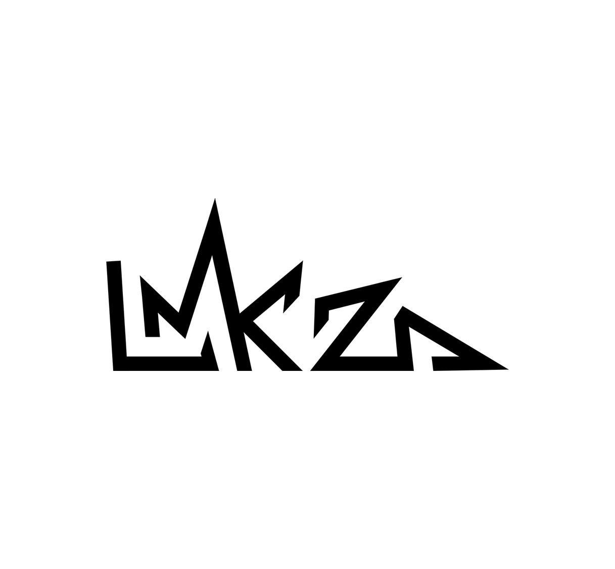
LMK ZA is a name built around identity, origin and ambition. LMK represents Lord Mak, a shortened expression of Lord Makopo, while ZA anchors the artist firmly in South Africa, giving the name an immediate geographic signature with international relevance.
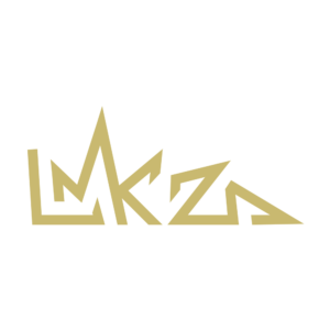
The logo translates this thinking into a bold, angular visual language. The letterforms have been constructed to feel individual rather than typographic, creating a mark that can become recognisable beyond the artist’s name. Sharp changes in direction, extended lines and intersecting forms introduce energy and movement, reflecting the attitude and rhythm associated with a contemporary music brand.
The central structure carries an almost crown-like presence, subtly supporting the idea of “Lord” without relying on a literal crown symbol. ZA is integrated into the same visual system, connecting the artist and his South African identity as one continuous signature.
The result is a distinctive artist mark designed for music, merchandise, digital platforms, performances and culture.
Purple & Mauve | Brand Identity Case Study
Purple & Mauve is the meeting point of two artists, two personalities and one shared love for house music. LMK ZA represents Purple, while Vuka Beats represents Mauve, giving each member of the duo his own colour and identity within the collective.
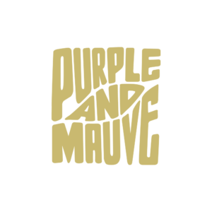
The logo captures that relationship through custom, expressive typography. Its oversized letterforms bend, stretch and shift across the composition with the freedom and movement of music. The irregular rhythm of the lettering reflects the energy of a house set, where individual sounds, beats and transitions continuously move together to create one experience.
Purple and mauve naturally form the foundation of the visual palette. Their close relationship on the colour spectrum mirrors the musical partnership between the two DJs, distinctive individually and harmonious together.
The stacked composition gives the identity a strong presence across album artwork, event posters, digital platforms, merchandise and stage graphics, creating a recognisable visual signature for Purple & Mauve.

Supa Guz | Brand Identity Case Study
Supa Guz carries the confidence of a brand shaped by music, fashion and cultural memory. Founded by Bangi Makopo, also known as LMK ZA, the name combines “Supa”, representing elevation and ambition, with “Guz”, a reference to the Kwaito legacy of TKZee & Family and an era that helped redefine South African youth culture.
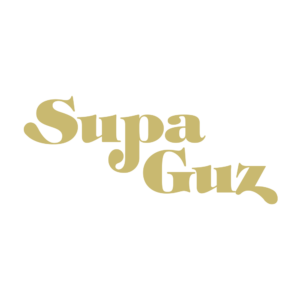
The logo draws from that history through bold, expressive typography with a distinctly retro character. Its curved forms and exaggerated proportions recall the visual language of 90s and early-2000s music, fashion, album artwork and entertainment, while retaining enough simplicity to live comfortably in a contemporary environment.
The playful relationship between Supa and Guz gives the mark personality, movement and attitude. It feels musical before any sound is heard.
Designed to move across events, fashion, music, media and lifestyle products, the identity gives Supa Guz a recognisable signature rooted in culture, creativity and self-expression.

HAZO | Brand Identity Case Study
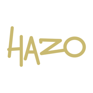
The HAZO identity is built around protection, connection and forward movement. Its custom-drawn wordmark uses a continuous, hand-rendered line language that gives the insurance brand a more distinctive and human character while retaining the confidence required in financial services.
Each letter contributes to the story. The tall vertical strokes of the H establish strength and stability. The A introduces structure and upward movement, while the elongated Z creates a strong directional path through the centre of the identity. That line flows naturally into the circular O, creating a sense of continuity, completion and protection. The circle can also be read as a protected space, reflecting HAZO’s role in surrounding clients, organisations, assets and people with considered risk solutions.
Deep navy blue anchors the identity in trust, authority and professionalism. Combined with the unconventional letterforms, it gives HAZO a visual language that feels assured, memorable and contemporary, positioning the brand confidently across insurance, risk management and employee benefits.

JONGOSI | Brand Identity Case Study
The Jongosi Construction identity draws its character directly from the meaning of its name. “Jongosi,” meaning a young ox in isiZulu, provides a powerful metaphor for strength, endurance and the potential to carry increasingly greater responsibility.
The wordmark is constructed in a bold, engineered typeface with substantial letterforms that communicate structural integrity and permanence. Its clean geometry reflects the precision required across building, civil and mechanical engineering, while the generous spacing of CONSTRUCTION creates a strong foundation beneath the primary name.
The defining detail is the ox symbol positioned above the I. Reduced to a simple silhouette, it becomes an immediate visual signature for Jongosi, connecting the company’s cultural identity to the qualities of the animal itself: resilience, discipline, power and steady forward movement. Its placement also gives the wordmark a distinctive, ownable feature.
The monochromatic palette reinforces practicality and authority, creating an identity designed to perform confidently across sites, vehicles, equipment, uniforms and technical documentation.

Who We Work With